LWC Toast Messages
Lightning Web component(LWC) can send a toast notification that pops up to alert users of success, error or warning. A toast can also simply provide information. To display a toast notification in Lightning Experience or Lightning communities, import ShowToastEvent from the lightning/platformShowToastEvent module. We can dispatch this toast on some event like click of button.
How to add toast message in Lightning Web component(LWC)
Import Toast Message
import { ShowToastEvent } from 'lightning/platformShowToastEvent'; |
Dispatch toast Message
showToast() { const event = new ShowToastEvent({ title: 'Toast message', message: 'Toast Message', variant: 'success', mode: 'dismissable' }); this.dispatchEvent(event);} |
Here are some point about toast message:
- We can style toast to provide error, success, warning and information message using mode parameter.
- We can also configure the visibility of the toast using variant. It can remain visible for three seconds, until the user clicks to dismiss it, or a combination of both.
- To trigger a toast from a Lightning web component, in the component’s JavaScript class, import ShowToastEventfrom lightning/platformShowToastEvent.
- Create a ShowToastEvent with a few parameters, and dispatch it.
Types of toast messages Lightning Web Component(LWC)
Error Toast
showErrorToast() { const evt = new ShowToastEvent({ title: 'Toast Error', message: 'Some unexpected error', variant: 'error', mode: 'dismissable' }); this.dispatchEvent(evt);} |
Success Toast
showSuccessToast() { const evt = new ShowToastEvent({ title: 'Toast Success', message: 'Opearion sucessful', variant: 'success', mode: 'dismissable' }); this.dispatchEvent(evt);} |
Warning Toast
showWarningToast() { const evt = new ShowToastEvent({ title: 'Toast Warning', message: 'Some problem', variant: 'warning', mode: 'dismissable' }); this.dispatchEvent(evt);} |
Info Toast
showInfoToast() { const evt = new ShowToastEvent({ title: 'Toast Info', message: 'Operation will run in background', variant: 'info', mode: 'dismissable' }); this.dispatchEvent(evt);} |
LWC Toast Messages Example
toastNotificationExampleLWC.html
<template> <lightning-card title="Notification" icon-name="custom:custom19"> <lightning-button label="Show Error" onclick={showErrorToast}></lightning-button> <lightning-button label="Show Success" onclick={showSuccessToast}></lightning-button> <lightning-button label="Show Warning" onclick={showWarningToast}></lightning-button> <lightning-button label="Show Info" onclick={showInfoToast}></lightning-button> </lightning-card></template> |
toastNotificationExampleLWC.js
import { LightningElement } from 'lwc';import { ShowToastEvent } from 'lightning/platformShowToastEvent';export default class ToastNotificationExampleLWC extends LightningElement { showErrorToast() { const evt = new ShowToastEvent({ title: 'Toast Error', message: 'Some unexpected error', variant: 'error', mode: 'dismissable' }); this.dispatchEvent(evt); } showSuccessToast() { const evt = new ShowToastEvent({ title: 'Toast Success', message: 'Opearion sucessful', variant: 'success', mode: 'dismissable' }); this.dispatchEvent(evt); } showWarningToast() { const evt = new ShowToastEvent({ title: 'Toast Warning', message: 'Some problem', variant: 'warning', mode: 'dismissable' }); this.dispatchEvent(evt); } showInfoToast() { const evt = new ShowToastEvent({ title: 'Toast Info', message: 'Operation will run in background', variant: 'info', mode: 'dismissable' }); this.dispatchEvent(evt); }} |
toastNotificationExampleLWC.js-meta.xml
<?xml version="1.0" encoding="UTF-8"?> <apiVersion>48.0</apiVersion> <isExposed>true</isExposed> <targets> <target>lightning__AppPage</target> <target>lightning__RecordPage</target> <target>lightning__HomePage</target> </targets></LightningComponentBundle> |
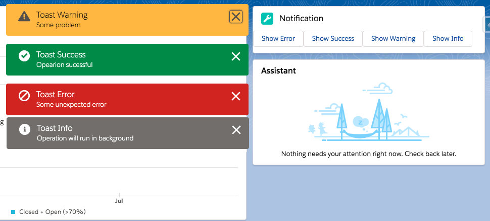
Now we can add this LWC component on the home page.
- Go to Home page
- Click Setup (Gear Icon) and select Edit Page.
- Under Custom Components, find your toastNotificationExampleLWC component and drag it on right-hand side top.
- Click Save and activate.
We will get the following output
Here is list of Toast Event Parameters:
| PARAMETER | TYPE | DESCRIPTION |
|---|---|---|
| title | String | The title of the toast, displayed as a heading. |
| message | String | A string containing a message for the user. |
| messageData | String[] or Object | url and label values that replace the {index} placeholders in the message string. |
| variant | String | The theme and icon displayed in the toast. Valid values are: info—(Default) A gray box with an info icon. success—A green box with a checkmark icon. warning—A yellow box with a warning icon. error—A red box with an error icon. |
| mode | String | Determines how persistent the toast is. Valid values are: dismissable—(Default) Remains visible until the user clicks the close button or 3 seconds has elapsed, whichever comes first. pester—Remains visible for 3 seconds. sticky—Remains visible until the user clicks the close button. |
For more details please refer to official link.

No comments:
Post a Comment